Posted by & filed under Data, Science, January 19 2022.

1. Truth in Data

In a blog posting from April 2020, I discussed the development of a visualisation of data related to the global COVID-19 pandemic. In the comments below the blog posting, I mentioned that there are several issues with the data in terms of accuracy and what the ‘truth ‘ of the data actually is. I will expand on this here.

Defining precisely what the ‘truth’ is in data and statistics is not easy. Most statistical data in the real world is generated from statistical samples and then a process of inductive inference, based on statistical theory, is used to generalise observations and conclusions to a broader ‘population’. Many errors and biases can be introduced in this process, and many assumptions must be made. A common error is that the sample is not representative of the population (Baggini, 2017; Spiegelhalter, 2019).

Another error is that all conclusions about data collected in the real world ultimately rely on how well the conceptual ‘model’ used for the data collection and analysis approximates the real world, and sometimes too much faith can be based on the model’s claims to objective ‘truth’, leading to sensationalist claims in newspapers (Cairo, 2016).

Epidemiology, and data concerning the global COVID-19 pandemic is no different, and any claims for objective conclusions about the impact of the pandemic on global society based on this data must include details about how the data is collected, analysed and presented, and the assumptions that have been made in this process.

The global pandemic of the last 2 years has seen newspapers, TV and web news reports and social media full of data in perhaps an unprecedented fashion; people have never been more exposed to statistics, graphs and data visualisations concerning the number of COVID-19 cases and deaths. Some of this has demonstrated good examples of data collection and analysis (European Centre for Disease Prevention and Control, 2021), and presentation in the form of data visualisations (BBC, 2021a; The Guardian, 2020a),  but there have been many bad examples of misleading communication concerning the ‘truth’ of the pandemic (The Conversation, 2020).

This flood of data (or ‘infodemic’) has led to much discussion about how well the data reflects reality: how many people around the globe have the virus, and how many people have died because of it? Issues of ‘truth’ in health data have never been more hotly debated and analysed. There are many threats to truth, including a general mistrust in science, experts and politicians, but also a reliance on untrustworthy social media sources and groups promoting ‘disinformation’ and anti-vaccination beliefs (The Lancet, 2020).

A common bias in many countries inherent in collecting data about cases of infection by COVID-19 is that only people with symptoms are tested, so asymptomatic cases are unrecorded, resulting in a systematic bias causing an underestimation of infection rates, which can be quite significant (Spiegelhalter and Masters, 2021). ”The apparently simple task of counting COVID-19 deaths is far from easy, with no ‘true’ answer” (Spiegelhalter and Masters, 2021: 108).

In many cases, including in western governments, collection of COVID-19 data has fallen short of statistical ideals. For instance, in the UK at the start of the pandemic, COVID-19 ‘deaths’ were presented in a way which was misleading (there was no time limit for deaths after the date of a recorded infection). This was changed to a 28-day limit in August 2020 (Spiegelhalter and Masters, 2021).

2. Comparing Countries

One problem with the presentation of this data globally has been the difficulties arising from a lack of any standardised way of analysing the data and presenting case and death numbers. Different countries (and even health and statistics agencies within the same country) use different methods and definitions: for example, even within western Europe there are important differences, with some countries counting deaths in care homes and hospitals and others not, and some countries only counting deaths where the virus is mentioned on death certificates, and others only where there has previously been a positive test for the individual. Others use only numbers of excess deaths (‘excess mortality’).

Another issue with comparing death rates between countries is that some countries have quite differing age distributions among their populations, and COVID-19, which causes more deaths in older people, disproportionally affects countries with a relatively elderly population. Comparing countries at a national level is also problematic because death rates (in 2020) in some countries were highly localised within regions and cities (such as Spain and Italy) and some countries were affected throughout the entire national area (such as the UK). Data collected at country-level hides this geographic distribution. There are also different data anonymisation and aggregation practices between countries.

Other countries such as Tanzania, North Korea, China, Iran and Turkmenistan are governed by unstable, secretive or undemocratic governments and the data they have claimed about numbers of cases and deaths in their respective countries are probably wildly inaccurate. Even a country such as the USA did not start properly collecting and reporting data at a federal level until March 2021 (BBC, 2020; The Guardian, 2021; Spiegelhalter and Masters, 2021).

3. Outlook and the Future

In April 2020, Professor David Spiegelhalter wrote an article for the Guardian website that outlined the difficulties inherent in comparing COVID-19 cases and deaths between countries. This was then interpreted by the UK Prime Minister Boris Johnson, in a statement in the UK parliament in May 2020, as meaning that comparing countries was, in the words of the chief medical officer Professor Chris Whitty, a “fruitless exercise”. This highly public example shows that the ‘truth’ of data can be distorted with poor presentation and communication, and Professor Spiegelhalter tried to clarify things in subsequent public writing to emphasise that “we should now use other countries to try and learn why our numbers are high” (The Guardian, 2020b).

Even with all of these difficulties, it is important to study the differences between populations and countries. Some useful science, and ‘truths’ can be evaluated from the data, such as that one particular strategy used by a group of countries to control the virus (such as a national lockdown or social distancing) is associated with a broadly different mortality rate than another strategy used by other countries.

Improvements in data communications to the public, and better effectiveness in terms of affecting outcomes in dealing with the pandemic, can be fostered by international collaboration, diversity of approaches, and better data collection and education (Pearce et al., 2020).

References

Baggini, J. (2017) A Short History of Truth: Consolations for a Post-Truth World. Quercus.

BBC (2020) Coronavirus: Why are international comparisons difficult? [Online] [accessed 15th November 2021] https://www.bbc.co.uk/news/52311014

BBC (2021a) Covid map: Coronavirus cases, deaths, vaccinations by country [Online] [accessed 15th November 2021] https://www.bbc.co.uk/news/world-51235105

BBC (2021b) Covid: The UK is Europe’s virus hotspot – does it matter? [Online] [accessed 25th November 2021] https://www.bbc.co.uk/news/health-58849024

Cairo, A. (2016) The Truthful Art: Data, Charts and Maps for Communication. New Riders.

The Conversation (2020) Next slide please: data visualisation expert on what’s wrong with the UK government’s coronavirus charts [Online] [accessed 25th November 2021] https://theconversation.com/next-slide-please-data-visualisation-expert-on-whats-wrong-with-the-uk-governments-coronavirus-charts-149329

European Centre for Disease Prevention and Control (ECDPC) (2021) How ECDPC collects and processes COVID-19 data [Online] [accessed 15th November 2021] https://www.ecdc.europa.eu/en/covid-19/data-collection

The Guardian (2020a) How coronavirus spread across the globe – visualised [Online] [accessed 15th November 2021] https://www.theguardian.com/world/ng-interactive/2020/apr/09/how-coronavirus-spread-across-the-globe-visualised

The Guardian (2020b) Author of Guardian article on death tolls asks UK government to stop using it [Online] [accessed 15th November 2021] https://www.theguardian.com/politics/2020/may/06/author-of-guardian-article-on-death-tolls-asks-government-to-stop-using-it

The Guardian (2021) Which countries have fared worst in the pandemic? [Online] [accessed 15th November 2021] https://www.theguardian.com/theobserver/commentisfree/2021/apr/18/which-countries-have-fared-worst-in-the-pandemic

The Lancet (2020) The truth is out there, somewhere. Lancet, 396(10247): 291.

Pearce, N., Lawlor, D. A., & Brickley, E. B. (2020) Comparisons between countries are essential for the control of COVID-19. International journal of epidemiology, 49(4): 1059–1062.

Spiegelhalter, D. (2019) The Art of Statistics: Learning from Data. Pelican Books.

Spiegelhalter, D. and Masters, A. (2021) Covid by Numbers: Making Sense of the Pandemic with Data. Pelican Books.

Posted by & filed under IT & the Internet, Science, Software engineering, April 10 2020.

ecdpc2


One thing that has become noticeable in the current COVID-19 pandemic is a plethora of web-based visualisations about the impact of the virus. Most of these are line graphs showing exponential or vaguely bell-shaped curves and peaks typical of mathematical models of the spread of diseases.

5e82cad77264b.image

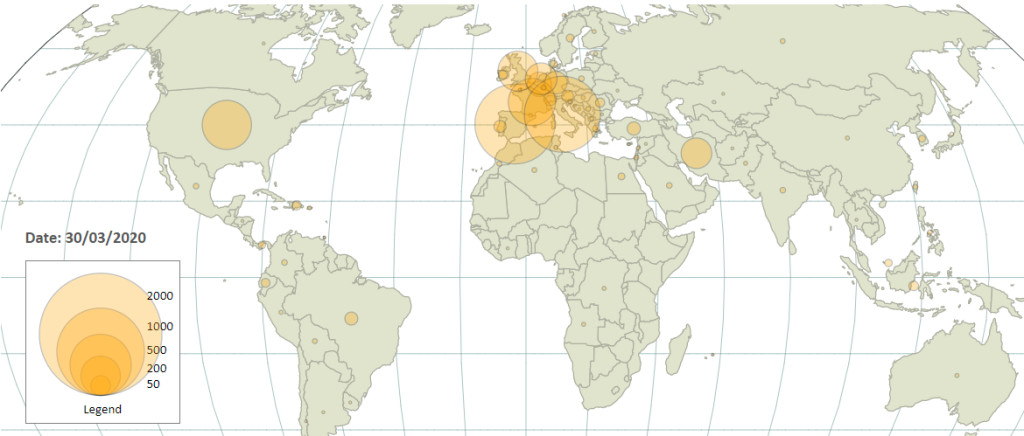
Many of these visualisations show the spatial, or geographic, distribution of the virus, typically with a static map showing cases and deaths per country, or area of a country. Many of these visualisations also show the temporal distribution, typically with a line or bar chart. There aren’t many visualisations that combine both of these approaches, showing the spatial and temporal simultaneously.

The UK BBC and Guardian news websites have recently posted a couple of articles with good visualisations:

The BBC page has an animated horizontal bar chart that dynamically shows the changing rank over time of countries by number of cases of the virus reported in that country. This combines the spatial and temporal aspects of the spread of the virus, but without a map.

I like the ‘dynamic globe’ Guardian visualisation, which does show the spatial and temporal distribution of the virus in a very clever and technically impressive way, but I feel that it is a bit too visually ‘busy’ and perhaps counter-intuitive in terms of the amount of visual elements that a viewer has to process.

I have developed my own GIS visualisation that expresses what I think I as a consumer of this data would like to see, in terms of perceiving and understanding how the virus has spread across the world.

One of the major challenges in creating a visualisation like this is obtaining the data to drive the visualisation – contemporary events are so current and fast-changing, that any data that is collected in the immediate short-term is necessarily incomplete and subject to all sorts of limitations in terms of authority, accuracy, relevancy and future revisions.

With these caveats in mind, I settled on using data from the European Centre for Disease Prevention and Control (ECDPC), which collects data about reported COVID-19 virus-related cases and deaths from each country in the world, starting from 31/12/19. This data is open, and made available with daily updates for anyone to obtain and utilise, in data analysis-friendly formats such as CSV and JSON. The data is rich enough (using things such as ISO 3166 country codes) and granularised enough (by country and day) that it allows for further development, allowing the combination of the virus data with data from other sources, such as spatial data in the form of country polygons (from Natural Earth, an open service provided by the North American Cartographic Information Society) and country centroids (from WorldMap, an open service provided by the Center for Geographic Analysis at Harvard University). I used mapshaper to convert the country polygons Shapefile to GeoJSON format, and also generalise the polygons to reduce the file size without compromising the visualisation of individual countries too much.

I used the D3 JavaScript library for creating the interface, which is a very powerful and open-source tool for creating web-based visualisations, with good support for maps and spatial data. One of my frustrations with many map-based visualisations on the web is that they use inappropriate map projections such as Mercator, but D3 allowed me to use the Kavrayskiy VII projection, which I believe is a good compromise in terms of representing shapes and distances on the globe of the Earth relatively accurately and intuitively to the viewer, on a flat interface.

I used D3 to create a ‘proportional symbol map’ (this terminology is taken from Andy Kirk’s taxonomy of chart types, in his book ‘Data Visualisation: A Handbook for Data Driven Design‘, 1st edition, page 203) using circles to represent data values, with the area of a circle directly proportional to the data value. The circle centres are located on the centroid point of each country. One of the idiosyncrasies of using centroids as a single point to represent the location of a country is that some countries have centroids in perhaps counter-intuitive locations, such as France (due to the location of French Guiana) and the USA (due to the locations of Alaska and Hawaii). This is explained here. For these two countries, I manually edited the centroid data to make it more intuitive and visually appealing to a viewer (but of course less geographically accurate).

D3 also allowed me to ‘animate’ the map, so that daily data is cycled and new data is shown once per second, with the circles shrinking or expanding corresponding to the changing data values, allowing a viewer to see the temporal progression and geographic spread of the virus over time in a dynamic way. This is done using D3 transitions. I used PHP server scripts to harvest and manipulate the raw data into formats I could use.

I chose a starting date for the visualisation of 01/02/20. The alarming spread of the virus becomes visually apparent at about the mid-March 2020 point. The visualisation is designed to update automatically with new data harvested daily from the ECPDC, so the full progression of the pandemic should become apparent over time. At the time of writing this blog posting (mid-April 2020) the world (and particularly Europe and the USA) is deep in the middle of the pandemic.

The visualisation is hosted on an AWS EC2 instance and can be seen here:

https://bit.ly/2Xk6zTh

And the code can be seen on GitHub here:

https://github.com/EddieBoyle2019/ecdpc

Posted by & filed under IT & the Internet, Mountains & hills, Personal, Science, Software engineering, August 24 2017.

The three-year part-time remote learning UNIGIS UK MSc course I recently finished had two very different components – the first two years consisted of teaching modules of learning materials and assessed assignments (see my earlier blog posting about this here), and the third year involved the planning, development and writing of a dissertation, which is the final ‘research’ stage in getting the MSc degree. A dissertation is different from taught components of a course in that it requires formal academic research undertaken by the student and is a significant piece of original work, based on ideas originating largely from the student, and implemented and developed on the student’s own initiative and using their own skills. It is a real test of whether a student has ‘academic’ skills and is what sets a masters postgraduate degree apart from undergraduate degrees.

I had been thinking about ideas for my dissertation since the start of the course and I knew I wanted to explore the topic of exploring the physical characteristics of landscape in some way using my existing skills and experience as a web developer and software engineer, allied to the types of analysis and methods that are used in the field of Geographic Information Systems or Science (GIS). The primary starting point for an original piece of research is to establish a ‘research question’ that addresses some area in the field that has not been explored before, so my plan for getting ideas for this was to read as many published academic research papers as I could in the field of GIS that covered areas like land use, rural and upland environments and the use of spatial data models such as Digital Elevation Models. What really sparked the idea for what became my dissertation topic was a paper entitled ‘A GIS model for mapping spatial patterns and distribution of wild land in Scotland‘ by Dr Steve Carver (and others) of the Wildland Research Institute at the University of Leeds.

This paper led to a lot of further reading about the use of GIS techniques, spatial concepts and maps to explore the idea of ‘wilderness’ or ‘wild land’ which appealed to my existing interest in mountains, and I decided to concentrate on using the Scottish Highlands as a location for the focus of the research. The idea of ‘wild land’ in Scotland and what this actually means in a practical sense is a topic with some currency and this is seen in contemporary debates and research work concerning parts of Scotland that have been defined as ‘wild areas’ (in this case by Scottish Natural Heritage). The terms ‘wilderness’, ‘wild land’ and ‘wild areas’ have some ambiguity and are reliant on notions heavily affected by human perception, experiences and subjectivity and hence I always put the terms in quotes to denote this lack of precise definition. Much of the GIS research in this area has explored this ambiguity and this would be a central theme of my dissertation.

Papers such as ‘Using distributed map overlay and layer opacity for visual multi-criteria analysis‘ gave me ideas about building a GIS web-based tool which could explore the concept of ‘wild land’ in a way that hadn’t been done before. These ideas developed more formally with the research project proposal document I had created for the Methods in GIS module towards the end of second year of the course, but the ideas themselves constantly evolved all the time, right up until the dissertation itself was completed and submitted.

The first formal step in the creation of the dissertation was to get my ideas accepted as a coherent piece of valid, justified and original research by the UNIGIS UK team and this was done by submitting a formal MSc project proposal form at the start of the third year. This drew heavily on the research project proposal document I created in the second year and its main purpose was to present a research idea and plan with the potential at that early stage to become a dissertation, before work started in earnest. This is a vital step as it is important that a student does not head down a blind alley of unjustifiable research or take on a task that is beyond the scope of a MSc dissertation or not suitably related to the field of GIS. Once this proposal was accepted, an academic supervisor for the dissertation was allocated to me, and groundwork for the dissertation could start which mostly involved reading previous academic research publications and investigation of GIS-related software packages and web applications.

The research for the dissertation was further developed with the Extended Project Outline (EPO), a 2000-word document that benefited from formative feedback from my supervisor so that the ideas in it had been challenged, discussed and developed until they represented a good preliminary ‘grounding’ for the dissertation research to follow. At this stage the aims and objectives of the research were refined in discussions with my supervisor and altered so that they provided a focused target for the direction of the rest of the dissertation work. An important early outcome of these discussions was that I hadn’t initially intended to focus on the public participation geographic information systems (PPGIS) aspect of the web tool, but this change led to the idea of using only ‘open’ data and free and open-source software (FOSS) in the tool and the ‘accessibility’ of the tool becoming a major requirement.

The text of the aim of the research which defines the entire dissertation is:

‘The aim of this dissertation is the development of a publicly-available web-based GIS mapping tool, and the evaluation of the effectiveness of this tool in supporting a PPGIS approach, using the example of exploring the concept of ‘wild land’ in the Scottish Highlands’.

At this stage also the title of the dissertation was finalised to:

‘A web-based GIS tool to allow public exploration of the concept of ‘wild land’ in Scotland’.

The title and aim provide a good summary of the entire dissertation and everything in it can be considered as flowing from this.

The main research methodology underlining the dissertation was also defined at this early stage, and was to be, broadly speaking, a ‘quantitative’ approach in that it would involve the development of a technical software tool and importantly, an evaluation of that tool. This would be a largely desk-based process involving only my own time and efforts and could be described as ‘prestructured research’ in that it wasn’t open-ended and there was intended to be a clear outcome i.e. a measure of how well the web tool met the research objectives in terms of the ‘quality’ of the spatial data used and the usability of the web tool interface. Some dissertations involve ‘qualitative’ methods such as user surveys, interviews and questionnaires, and I decided at an early stage that this would be outside the scope of the dissertation – although these methods could potentially be used in futher research based on the work in the dissertation.

Once the EPO and the dissertation plan was approved (this document actually contributed 10% of the final dissertation mark), then the full work for the dissertation began, and this process took 4 months. Although this was not much longer than is usual for a dissertation in a traditional one-year full-time MSc course, a lot of the groundwork for the dissertation had been done in the preceding 12 months. The dissertation was required by UNIGIS to be no more than 15,000 words and to conform to established academic formats and styling. My supervisor guided me in the process of writing the dissertation with essential feedback on chapters, and contact was maintained throughout this period with Skype audio meetings and emails.

An important thing that I learned in this process is that it is important to create a research plan that is achievable within the resources available to the student (principally time) and appropriate for the level of a MSc dissertation – it can be easy to fall into the trap of taking on something that is more suitable for a full PhD, for instance. An important consideration also is the data that is required for the dissertation and whether it can be obtained and utilised within the timeframes and resources available to the student (e.g. licencing restrictions). The focus of my proposal on ‘open’ data and FOSS meant that this consideration was not a major hurdle, and indeed ‘accessibility’ of data and services was crucial to the theme of the dissertation which focused on PPGIS.

My plan for the dissertation was always that I should create a relatively sophisticated web-based tool as well as writing the dissertation about the tool so that there were essentially two deliverables involved, potentially requiring a lot of work and effort in the form of software design and development as well as research and writing. My strategy throughout however was always to focus on my strengths and what I knew I could do in terms of developing a web tool involving technologies I was familiar with such as HTML, CSS, JavaScript and a web-based client-server architecture.

One technical problem I faced at an early stage was where to host the various components of the web tool architecture. The client-side aspect of the tool was relatively straightforward, being web pages composed of browser-based technologies such as HTML, CSS and JavaScript, which can be hosted on any standard webhosting service (which I already have with the hosting of my personal website at edwardboyle.com). However, the server-side aspect was more challenging and had several technical requirements: command-line superuser remote SSH access to a linux environment with sufficient user privileges and an environment allowing the installation of third-party applications and libraries; sufficient disk space and CPU power; reliability and 24/7 uptime; HTTP access; sufficient timespan of the hosting service to cover the period of development and presentation of the web tool. Crucially, my personal webhosting service does not support the first of these requirements and this sort of service is usually only available with specialist webhosting services for a fee. Unfortunately UNIGIS UK were not able to provide this level of technical support so I was left to my own devices, and for a while this was a problem that may have stopped the entire dissertation. However, as part of my investigation of technical applications, I became aware of the possibility of using Amazon Web Services (AWS), something I had previously heard of but did not know much about the details and had never used before. The AWS platform provides all of the technical requirements I needed with its EC2 service and amazingly, offers it free for a year’s trial for non-commercial purposes – a perfect solution for a student’s needs. I ended up implementing my entire web tool architecture on AWS.

An important first stage in the dissertation was undertaking of a critical literature review, and this was essentially done as a parallel process with the design and development of the architecture of the web tool. The literature review involved reading a large amount of previous related research and the two areas fed into each other, with the literature defining the methods that others had used in this area and what hadn’t been done before, and the consideration of available technology defining what was possible and which existing applications, software libraries and technology frameworks were appropriate for the task.

The final choice of FOSS GIS technologies for the tool were GeoServer for the server component of the architecture, and the OpenLayers JavaScript API and library for the client component. These technologies fitted all of the requirements well, which were basically to provide a web-based environment which was completely customisable, supported GIS functionality, and were as ‘accessible’ as possible with minimal licencing restrictions so that the main aim of the web tool and hence the research area of the dissertation, to evaluate the potential of PPGIS methods to analyse and explore the concept of ‘wild land’, could be supported. I also decided to geographically restrict the area that was analysed in the web tool, to simplify and reduce the amount of spatial data to be processed and delivered, making it more manageable and usable. I decided to focus on the area of the Cairngorms National Park which has a defined boundary, is one of the largest areas of ‘wild land’ in the UK, and is an area of Scotland I know very well.

An important first step in developing the web tool and deciding what technologies to use was the building of a basic prototype to discover if the ideas were feasible and to provide a platform on which to build further. The prototype was just the first stage in the process of software development which broadly followed the Rapid Application Development methodology, which I have extensive experience of, and which in this case involved several cycles of feedback from my dissertation supervisor (particularly concerning the usability of the interface of the web tool) and associated iterative development of the web tool.

The actual writing of the dissertation and development of the web tool went largely to plan and allowed me to submit the dissertation on time (at just under the 15,000 word limit) in May 2017. I was able to change the working hours of my job to part-time during this period and this helped greatly. Whilst I spent many hours of my spare time in early 2017 on this, and there were many problems to solve and issues to deal with, things fell into place quite neatly and I am proud of the final product which presented some interesting web technologies and GIS concepts in a novel way within an established research framework. Major outcomes and findings of the research were that the FOSS applications, particularly GeoServer and OpenLayers, and the ‘open’ data, particularly the Ordnance Survey OpenData service (which only became available for the first time in 2010), were very well suited to the objectives of the research and allowed a genuinely useful web tool to be built to investigate what the notion of ‘wild land’ means in a thoroughly-grounded academic GIS research context. The final level of success of the completed web tool was not completely apparent to me at the outset of the process of developing ideas for the dissertation, and even during the development of the web tool and the writing of the dissertation. I believe that the general success of the outcomes of the dissertation reflects the current maturity, sophistication and richness of FOSS GIS applications and ‘open’ data and also shows the new opportunities for research that are available, and that this positive outcome would have been unachievable only a few years ago. The ideas and themes behind the research objectives in my dissertation would have made for a much more difficult undertaking if I had been writing the dissertation in say, 2007 instead of 2017.

The dissertation received a very high mark, and combined with the marks I had obtained in the taught component of the course, I was awarded the MSc degree with distinction by the University of Salford in June 2017. This dissertation won an award for best UNIGIS UK dissertation of 2017 and has also been nominated for an award in the international UNIGIS academic excellence prize competition.

The completed dissertation is available at (PDF format):

http://www.edwardboyle.com/MSc_Dissertation.pdf

The dissertation is also available on the Figshare service at this DOI URL:

https://doi.org/10.6084/m9.figshare.5354011.v1

The final version of the web tool can be seen at:

http://www.edwardboyle.com/MSc/tool1.html

Posted by & filed under IT & the Internet, Mountains & hills, Personal, Science, Software engineering, August 21 2017.

I haven’t written anything in my blog for the last three years, and that is partly due to the fact that during that time I have been directing a lot of my energies to a postgraduate course, a Master of Science (MSc) degree in Geographic Information Science or Systems (GIS). I have now finished the course, which went very well.

The course was delivered by UNIGIS UK (a collaboration between Manchester Metropolitan University and the University of Salford), and one of the things that attracted me to the course is the remote learning nature of the course and the fact that the entire course of study is carried out part-time over a three year period (instead of the more usual one year for a full-time MSc course). This allowed me to continue working full-time and earning money whilst studying in my spare time for the course. Another attractive thing about the course is that a qualification can be awarded at the end of each successfully completed year of study, a Postgraduate Certificate after the first year, a Postgraduate Diploma after the second year, and the full Master of Science degree at the end of the third year. This is unlike traditional one year full-time Masters courses, where a lot of good work can achieve no credit if a student doesn’t complete the entire course (this happened to me on an earlier attempt at a GIS MSc). UNIGIS UK offers its MSc programme in three different ‘pathways’ and I chose to study the Geographical Information Technologies pathway.

The taught component of the course is modular, and is assessed using a mixture of formative and summative assessment methods, with the summative component taking the form of 12 very large pieces of assessed work set in a sequential fashion in the first two years, with two for each module, and which are required to pass the various taught components of the course. These assessed assignments are undertaken by the student at their own pace (although with fixed submission deadlines) in an environment of their own choosing, using their own resources (books, broadband internet connection, computer hardware, software applications, online research etc.) There are no formal summative assessment exams, which I consider to be a major point in favour of this course. Feedback gained from the assessed assignments was very detailed and incredibly useful for advancing my knowledge of GIS as the course proceeded, indicating what I was doing well, and also, crucially, correcting or guiding me in areas where I got things wrong. The 12 assignments I undertook took the form of Word documents comprising a mixture of essays and technical reports in an academic format and style, and are in themselves each major pieces of work. I list them here, along with the modules they formed the assessed components of, and descriptions of the work I carried out for each assignment.

Year 1 Modules:

Foundations of GIS

  • Changing boundaries and definitions – a 2500-word essay covering the historical development of the field of GIS and the debate about whether it can be described as a set of technical methodologies or an actual ‘science’, entitled “From GIS to GISc. The symbiotic development of Geographic Information Systems and Geographic Information Science”.
  • Practical portfolio: 1) working with social data; 2) spatial operations and analysis – a technical document describing the practical application of Markov chain analysis with ONS census and DCLG IMD (Index of Multiple Deprivation) data and a site suitability analysis using multi-criteria evaluation and cartographic modelling techniques with Ordnance Survey, Environment Agency and CORINE land cover data, using the desktop ArcGIS 10 application.

Spatial Data Infrastructures

  • Spatial data capture, metadata and standards - a technical document describing the creation of a land use map and associated attribute data by manual vectorisation of an aerial image, and the creation of an ISO 19115 metadata record for the created dataset, using ArcGIS 10.
  • Spatial data quality and fitness for purpose - a technical document describing the evaluation of spatial data in terms of ‘fitness for purpose’ and ‘quality’, for the purposes of a site selection analysis, using ONS census, Ordnance Survey and Environment Agency data.

Databases

  • NoSQL Databases and ‘Big Data’ – a 3000-word essay describing the advantages and limitations of NoSQL databases, in the contexts of spatial and ‘big data.
  • Development database – a technical document describing the development of a relational database using conceptual and logical models (with an Entity Attribute Relation diagram and normalisation methods), the physical implementation of the database model using the PostgreSQL application (with constraints and indexes), and the querying of the database with SQL queries incorporating table joins.

Year 2 Modules:

Distributed GIS (option for the GI technologies pathway)

  • Aspects of web GIS practical portfolio: 1) interoperability and standards; 2) the benefits and challenges of distributed GIS – a technical document describing the construction of OGC WMS- and WFS-specification compliant queries to dynamically retrieve PNG maps and XML GML data via REST-style HTTP GET URLs from a remote server, and also the construction of a map within the QGIS desktop application by retrieving data layers dynamically from a remote WFS server – also a 2250-word essay describing the benefits, limitations and challenges of Distributed GIS, focusing on SDIs, the ‘GeoWeb‘, VGI and disaster/emergency management. 
  • Web GIS Project - an interactive, responsive web-based map interface using the Google Maps API v3 with HTML, CSS, the JavaScript jQuery library and the Bootstrap library and KML data layers derived from UK Data Service boundary data, and a technical document describing the development of this interface – the interface can be seen at: http://www.edwardboyle.com/MSc2/GMAP_HTML.html

Spatial Databases and Programming (option for the GI technologies pathway)

  • Design, implement, interrogate and visualise a spatial database - a technical document describing the development of a relational spatial database using conceptual and logical models (with an Entity Attribute Relation diagram and normalisation methods) supporting specified requirements including the production of reports and maps to meet queries about distances and locations, the physical implementation of the database model using the PostGIS application (with constraints, spatial attributes and spatial indexes), the populating the database tables with spatial data, the querying of the database with spatial OGC SFSQL queries incorporating subqueries, common table expressions, spatial table joins and spatial measurements, and the creation of PostGIS views to visualise the results of queries as data layers in QGIS.
  • A mini project of GIS application development – a suite of software files that delivers a basic standalone ‘tightly coupled’ Windows desktop GIS application (using Python, the QGIS API/PyQGIS and the Qt4 libraries) to support an interface that allows the importing and map-based visualisation of raster and vector datasets as map layers, the presentation of attributes, and spatial analysis of the data (a calculation of travel accessibility indexes using point locations), and a technical document describing the development of the software incorporating a user manual – a zipfile containing the package of software files can be downloaded athttp://www.edwardboyle.com/MSc2/eboyle_taa2_pyqgis.zip - to run the application, extract the files from the 110Mb zipfile and run the ‘job_app_bat’ file in the ‘PyQGIS_package_release’ directory.

Methods in GIS

  • A research design appraisal – a 2500-word document comprising a GIS research proposal in a strict academic format, using as a model preliminary ideas for an eventual MSc dissertation, outlining the research questions, aims, objectives, approach, methodology, methods to be used, and the expected outcomes, all presented in relation to existing academic literature and research, and incorporating an ethics and risk assessment – the proposal was developed with formative feedback from a tutor as well as a peer review process, and laid the groundwork for the dissertation carried out in the third year of the course.
  • A spatial analysis portfolio: 1) point pattern analysis using ArcGIS; 2) implementing geostatistical analysis with ArcGIS – a technical document describing the usage of spatial analysis techniques in ArcGis 10, including descriptive spatial statistics and calculations of nearest neighbour index/ratio for point locations of a supplied dataset of plant locations, evaluation of the methods and conclusions about whether points are clustered or dispersed, whether a pattern is random or non-random, the statistical significance of this, potential causes for the pattern, also spatial interpolation methods (IDW, Trend Surfaces and Ordinary Kriging) using Met Office data, and evaluation and comparison of spatial interpolation methods using validation and calculation of errors.

A major component of the course is the research-based dissertation, which was undertaken in the third year of the course, and which I have discussed in a later blog posting here.

The nature of this learning and assessment framework means that a student learning about GIS in this way gains a great depth of knowledge and understanding in the 12 areas that the assessed assignments cover, which is very valuable, but other areas outside this do not get anywhere near the same level of attention – however, the 12 assignments cover a huge range of techniques, technologies, ideas, concepts and debates in the field of GIS and the end result I believe is a deeper understanding of GIS than is gained on an equivalent, traditional one-year MSc course that is assessed by exams, a framework which I believe does not allow areas to be explored in the same depth. Although in theory the three-year course contains exactly the same amount of work and required study time as a traditional one-year full-time course (200 hours per module), my experience is that the greater length of time allows for greater scope to think about ideas and concepts and to allow for more extensive research in the various areas. My experience also was that some modules require significantly more work than others, with the Spatial Databases and Programming module requiring an extensive investment of time and effort. Another advantage of this ongoing continuous assessment with feedback is that several ideas can be reinforced throughout the course and developed further with each assignment, such as the employment of ‘critical thinking‘, implementation of good cartographic techniques for map and data visualisations and the usage and incorporation into the assignments of an academic language style and rigourous academic format (background, literature, objectives, methodology, results, assumptions, limitations, conclusions, referencing etc.)

The remote learning nature of the course doesn’t suit all students, although it follows in the more established tradition of the Open University. In three years I never met a single fellow student or tutor in person, and all communication, discussion and delivery of course material such as lecture notes, demonstrations, tutorials, external resources, workshops, example exercises and self-test questions is done by online platforms such as email, instant messaging, videoconferencing, a web-based Virtual Learning Environment (VLE) application (Moodle) and multimedia and document files. A lot of the work is solitary and a student must rely on their own resources and initiative to complete the work, although there are discussion forums on the course VLE to discuss things with other students and the course tutors, and I was also in an ad-hoc Skype group of students which proved to be very useful. The remote student’s learning experience is heavily dependent on the willingness of the course tutors to engage with the online platforms. Much of the course used readily-available Free and Open-Source Software (FOSS) applications such as PostGIS and QGIS, but importantly, a licence is provided as part of the course so that the commercial ArcGIS desktop software can be used. Other things that are available as part of the course (without any extra fees) are web-based live seminars from invited GIS academics and industry professionals, subscriptions to current GIS paper-based periodical publications such as GeoConnexion and GIS professional, and a copy of the standard GIS textbook, Geographic Information Science and Systems, all of which are mailed to a student’s home.

Again, this style of postgraduate study will not suit all students – I believe it suits more mature students who may already have some experience of the field, either in a professional or academic environment, and who are used to working on their own without close direction. The UNIGIS learning environment and approach probably wouldn’t work for a younger person who has just graduated with no knowledge of GIS or things like software engineering or databases. In many ways the course brought together different strands of technical knowledge, skills and experience I have gained from several disparate environments in the 24 years since I graduated and the course allowed me to present them in a formal way to achieve the MSc degree.

The course fees may seem steep, but are reasonable compared to equivalent postgraduate courses and a major attraction of the course is the ability to pay the fees in instalments. A prospective student may well ask what these fees buy them, particularly in the context of remote-learning where a student is expected to rely a lot on their own resources, and a lot of the traditional student university experience is entirely absent. My view is that what a student is essentially buying on this course is access to academic experts from accredited Higher Education Institutions in the field of GIS who can give valuable feedback for the assessed assignments, and monitoring and guidance for the research dissertation, so that a student can gain the MSc qualification in a very flexible environment that can fit in with a lifestyle that may not allow for the more traditional methods of study. An important aspect of the UNIGIS MSc is that it is continually monitored by external examiners so that it meets the academic requirements and standard for this level of study.

Posted by & filed under Mountains & hills, Science, February 25 2014.

New research

Two academic papers have been published recently in the journal ‘The Holocene‘:

The two papers complement each other and describe different techniques to come to the same conclusion, that glaciers existed in corries in the Cairngorm mountains during the ‘late Holocene’, i.e. significantly later than the accepted date for the end of the last period of glaciation in the British Isles, which was the Younger Dryas stadial (also called the Loch Lomond readvance), about 11,500 years ago. They also speculate (and provide some evidence) that this may have been as recently as the period referred to as the ‘Little Ice Age‘ (LIA), corresponding roughly to the period from AD 1550 to AD 1850.

Read more »

Posted by & filed under Books, Mountains & hills, Science, September 24 2013.

A Zoologist on Baffin Island, 1953

A Zoologist on Baffin Island, 1953, by Adam Watson

I have been interested in the Canadian island of Baffin Island since ‘Frozen Fire: a Tale of Courage‘ by James Houston was a set text when I went to school. Baffin Island, which straddles the Arctic Circle in the Canadian Arctic Archipelago is in many ways the archetypal ‘Arctic’ location – it has sea ice, polar bears, mountains, glaciers, icecaps, icebergs, fjords, the fabled ‘Northwest Passage‘, whales and Eskimos (now of course, known as Inuit). So Adam Watson‘s book, published in 2011, about his journey to Baffin Island sixty years ago as a young man in 1953 has been on my reading list for some time.

Read more »

Posted by & filed under Mountains & hills, Science, October 11 2012.

At the Pinnacles snowpatch in Garbh Choire Mòr

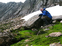
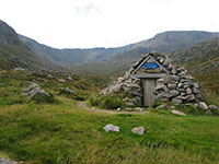
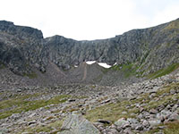
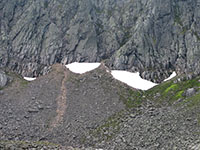
For several years now, there has been a secretive and remote location in the Scottish mountains that I have been trying to get to. This location is Garbh Choire Mòr, a corrie at the western end of the larger An Garbh Choire in the Cairngorm mountains, between Braeriach and Cairn Toul, and it is notable because it holds the most persistent snowpatches in the Scottish mountains (see my website pages about perennial snowpatches in the Scottish mountains here).

Read more »

Posted by & filed under Military/Aircraft, Mountains & hills, September 26 2012.

Mosquito wreckage on Cranstackie

Mosquito wreckage on Cranstackie

Three weeks ago whilst staying for a week in nearby Kinlochbervie, I climbed the 801m Corbett summit of Cranstackie in Sutherland. Cranstackie (along with its neighbouring Corbett summit of Beinn Spionnaidh) is the most northerly mountain (if you count a mountain as being above the Corbett height of 762m) in the British Isles, and Sutherland is a very dramatic and remote landscape.

Read more »

Posted by & filed under Military/Aircraft, Mountains & hills, August 17 2012.

On the summit of Lammer Law

On the summit of Lammer Law

At the end of March I did a 30km cycle route in the Scottish Borders. This route was a loop that started and finished at Longyester, and used 4×4 tracks to ascend to the 527m summit of Lammer Law and cross the high moorland of the Lammermuir Hills to the east of Lammer Law, along a track that follows a line of electricity pylons and doesn’t drop much below 400m. There aren’t many places in Scotland where you can cycle on decent tracks at such a high altitude. Unfortunately a new wind farm was being built on the moorland at Fallago Rig which I had to cycle through, although this was a Sunday and the site was quiet. I then continued on the B6355 road, which is one of the highest public roads in Scotland, rising to a height of nearly 440m, before an amazing descent, losing 200m of altitude in 4km.

Read more »