One thing that has become noticeable in the current COVID-19 pandemic is a plethora of web-based visualisations about the impact of the virus. Most of these are line graphs showing exponential or vaguely bell-shaped curves and peaks typical of mathematical models of the spread of diseases.

Many of these visualisations show the spatial, or geographic, distribution of the virus, typically with a static map showing cases and deaths per country, or area of a country. Many of these visualisations also show the temporal distribution, typically with a line or bar chart. There aren’t many visualisations that combine both of these approaches, showing the spatial and temporal simultaneously.
The UK BBC and Guardian news websites have recently posted a couple of articles with good visualisations:
The BBC page has an animated horizontal bar chart that dynamically shows the changing rank over time of countries by number of cases of the virus reported in that country. This combines the spatial and temporal aspects of the spread of the virus, but without a map.
I like the ‘dynamic globe’ Guardian visualisation, which does show the spatial and temporal distribution of the virus in a very clever and technically impressive way, but I feel that it is a bit too visually ‘busy’ and perhaps counter-intuitive in terms of the amount of visual elements that a viewer has to process.
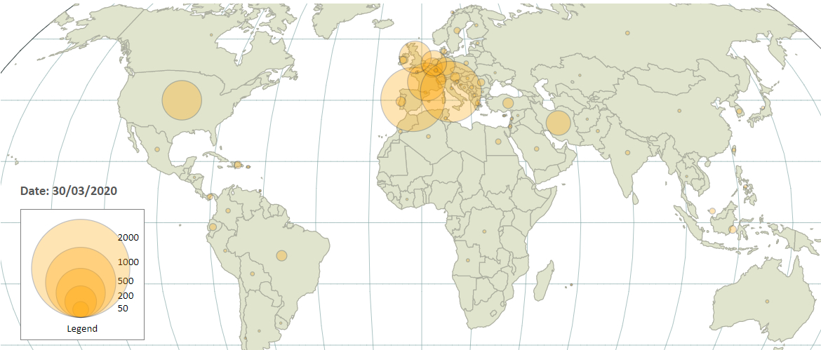
I have developed my own GIS visualisation that expresses what I think I as a consumer of this data would like to see, in terms of perceiving and understanding how the virus has spread across the world.
One of the major challenges in creating a visualisation like this is obtaining the data to drive the visualisation – contemporary events are so current and fast-changing, that any data that is collected in the immediate short-term is necessarily incomplete and subject to all sorts of limitations in terms of authority, accuracy, relevancy and future revisions.
With these caveats in mind, I settled on using data from the European Centre for Disease Prevention and Control (ECDPC), which collects data about reported COVID-19 virus-related cases and deaths from each country in the world, starting from 31/12/19. This data is open, and made available with daily updates for anyone to obtain and utilise, in data analysis-friendly formats such as CSV and JSON. The data is rich enough (using things such as ISO 3166 country codes) and granularised enough (by country and day) that it allows for further development, allowing the combination of the virus data with data from other sources, such as spatial data in the form of country polygons (from Natural Earth, an open service provided by the North American Cartographic Information Society) and country centroids (from WorldMap, an open service provided by the Center for Geographic Analysis at Harvard University). I used mapshaper to convert the country polygons Shapefile to GeoJSON format, and also generalise the polygons to reduce the file size without compromising the visualisation of individual countries too much.
I used the D3 JavaScript library for creating the interface, which is a very powerful and open-source tool for creating web-based visualisations, with good support for maps and spatial data. One of my frustrations with many map-based visualisations on the web is that they use inappropriate map projections such as Mercator, but D3 allowed me to use the Kavrayskiy VII projection, which I believe is a good compromise in terms of representing shapes and distances on the globe of the Earth relatively accurately and intuitively to the viewer, on a flat interface.
I used D3 to create a ‘proportional symbol map’ (this terminology is taken from Andy Kirk’s taxonomy of chart types, in his book ‘Data Visualisation: A Handbook for Data Driven Design‘, 1st edition, page 203) using circles to represent data values, with the area of a circle directly proportional to the data value. The circle centres are located on the centroid point of each country. One of the idiosyncrasies of using centroids as a single point to represent the location of a country is that some countries have centroids in perhaps counter-intuitive locations, such as France (due to the location of French Guiana) and the USA (due to the locations of Alaska and Hawaii). This is explained here. For these two countries, I manually edited the centroid data to make it more intuitive and visually appealing to a viewer (but of course less geographically accurate).
D3 also allowed me to ‘animate’ the map, so that daily data is cycled and new data is shown once per second, with the circles shrinking or expanding corresponding to the changing data values, allowing a viewer to see the temporal progression and geographic spread of the virus over time in a dynamic way. This is done using D3 transitions. I used PHP server scripts to harvest and manipulate the raw data into formats I could use.
I chose a starting date for the visualisation of 01/02/20. The alarming spread of the virus becomes visually apparent at about the mid-March 2020 point. The visualisation is designed to update automatically with new data harvested daily from the ECPDC, so the full progression of the pandemic should become apparent over time. At the time of writing this blog posting (mid-April 2020) the world (and particularly Europe and the USA) is deep in the middle of the pandemic.
The visualisation is hosted on an AWS EC2 instance and can be seen here:
And the code can be seen on GitHub here:

Eddie
I mentioned in this blog posting that there are considerations around the data in terms of accuracy, there is a good article on the BBC website outlining these issues here:
https://www.bbc.co.uk/news/52311014
Eddie
A visualisation quite similar to mine can be seen here, although I don’t think it’s visually as intuitive as mine, and it makes the common mistake in map-based visualisations of using colour-shaded country polygons to represent the ‘size’ of the data (a ‘choropleth’ map), when the polygon area in actual fact has no direct relation to the data value. This is particularly noticeable for countries like Canada and Russia, which are represented by large polygons (but are relatively sparsely populated), and hence appear more visibly prominent in the visualisation than they should, with respect to their relative data values compared to other countries – the opposite effect happens for the densely populated countries of Western Europe:
https://ourworldindata.org/grapher/daily-deaths-covid-19?tab=map&year=2020-04-26&country=IRN
Eddie
A great example of an interesting web-based map visualisation compromised by an inappropriate (Mercator) projection is The Refugee Project.
Eddie
I’ve just discovered this visualisation which does something similar to mine, but uses ‘cartograms’ instead of proportional symbols:
https://worldmapper.org/map-animation-covid19/
Eddie
A version of the visualisation which uses data from the start of March 2020 onwards and updates every half a second for each day’s data, can be seen here .
http://52.209.201.41/D3/ecdpc_foss4g.html
This is a bit more visually arresting.
Andrew Zolnai
As per tweet” Check mine out on GB / East Anglia take on same on my blog
Eddie
In June 2020 I attended the virtual FOSS4G UK conference, and gave a lightning talk about my visualisation, which can be seen on YouTube here:
https://www.youtube.com/watch?v=Up7ergMImQk
Eddie
I have changed and added some features to the visualisation:
URL: https://bit.ly/2Xk6zTh