1. The divide in the discipline of Geography

The Power of Maps by Denis Wood
Geography is a somewhat schizophrenic discipline. Is it a ‘social’ science or is it a ‘hard’ science? The two aspects of the discipline have been in conflict since the ‘quantitative revolution‘ of the 1950s and 1960s within Geography, and the ‘hard’ science of Geography is represented in many respects now by the field of Geographical Information Science (GIS).
Maps are at the very centre of this conflict – what they represent, what their purpose is, how they are constructed and perceived, and what effect they have on society and individuals.
To someone coming from a ‘hard’ science background it can be surprising to read the arguments from the other social science side of the debate. To a ‘hard’ scientist, maps and cartography in general can seem to be self-evidently ‘scientific’, rational, objective and just plain useful tools for many purposes: navigation, landscape management & planning and environmental visualisation amongst them. This apparent ‘positive’ aspect of maps is now more widespread and prevalent than it has ever been, with the wholesale integration into modern culture of web-based mapping tools such as Google Earth and Google Maps. To many, the benefits to modern society of mapping are so obvious as to not constitute grounds for serious debate at all. The assumption is that maps are ‘descriptive’ and represent the fruits of positive philosophy and the scientific method – they represent things ‘as they are’.
However, any serious student of GIS should realise that there is another side to this debate, exemplified by the arguments presented in books such as Ground Truth (edited by John Pickles and published in 1995) and The Power of Maps by Denis Wood (published in 1993). The Power of Maps in particular, presents many ideas that may be new to one who assumes that mapping and cartography have been, and continue to be, tools that are used dispassionately and ‘scientifically’ to aid society and individuals in general. These books pay attention to another interpretation of mapping – its use for prescriptive or ‘normative‘ ends – how things ‘ought to be’. This inevitably involves politics and power in human society and all the complicated and ‘unscientific’ aspects of this. The ‘descriptive’ or ‘positive’ interpretation of mapping is also subjected to heavy critical analysis.
The Power of Maps is an influential but flawed book. Its style of writing is complex, overly verbose, eccentric and idiosyncratically conversational all at the same time, and is almost illiterate in places. A lot of the content is gobbledygook and several sections of frustrating prose are impossible to interpret and could easily be placed in the Pseuds Corner section of Private Eye.
Wood espouses the ideas of the structuralist philosopher and literary critic Roland Barthes and extends these ideas in the Power of Maps to formulate his own critique of historical and contemporary mapping and cartography, particularly in reference to the signs and symbols used on maps. Unfortunately this approach is responsible for a large amount of unnecessary opacity affecting the core themes of the book making them all but incomprehensible. This is a major weakness of the book, as hidden amongst the impenetrable prose are important ideas about how maps function.
One of these important ideas is the notion of choice. The creation of a map is all about choices; what to put in the map, and what to leave out. This is a necessity, because no map can be an exact replica of the world it portrays (embodied in the notion of the ‘perfect’ map; see below).
Wood updated his ideas about maps in a follow-up book to the Power of Maps, Rethinking the Power of Maps (published in 2010), which ditches much of the distracting and overly philosophical verbiage (or should that be garbage?) of the Power of Maps and is hence much more readable. He also (with Ward Kaiser and Bob Abramms) wrote Seeing Through Maps (first published in 2001), which graphically analyses many examples of different mapping styles and the cartographic and political choices made (particularly in the choice of which projection to use) in the development of each, usefully providing many large pictures of the maps in the book as examples. Edward Tufte‘s seminal ‘The Visual Display of Quantitative Information‘ (first published in 1992) also touches on some of the strengths and weaknesses of mapping.
None of these books use colour in their display of the maps discussed in them however (apart from later editions of Tufte’s book), a limitation (presumably imposed by financial contraints) that makes the reader of the books aware of the power and importance of colour in mapping.
My personal viewpoint in this debate is that the arguments of Wood and Pickles should not be ignored but must be confronted and their more obvious and straightforward critiques should be acknowledged and accepted by anybody constructing or using maps. However, it would be wrong to suggest that because of these real problems, mapping and cartography in general and in particular modern web-based mapping tools and GIS software applications are somehow inherently undesirable, socially dangerous and structurally flawed. I don’t believe that they are, and I believe further that their enormous practical utility in diverse areas and profound strength as tools for investigating and analysing the environment outweigh any potential or perceived negative qualities that they may have. One must not fall into the trap when being confronted with the arguments from the social science side of the geographic mapping debate of throwing the baby out with the bathwater.
Quite beyond these issues pointed out from the social science side of the geography debate, there are recognised problems in GIS that have been thrown up from the ‘hard’ science side; namely the ecological fallacy, the modifiable areal unit problem, and the failure of traditional statistical techniques to cope with spatial data (spatial autocorrelation). All GIS students must be aware of these problems, acknowledge them and always work with the limitations they impose in mind.
2. The perfect map
The notion of the ‘perfect’, or 1:1 scale map is one which has been satirised in literature. In the Lewis Carroll story ‘Sylvie and Bruno Concluded‘ published in 1893 (chapter 11, entitled The Man in the Moon) there is the following exchange between the Historian (the narrator of the story) and Mein Herr:
“…What a useful thing a pocket-map is!” I remarked.
“That�s another thing we�ve learned from your Nation”, said Mein Herr, “map-making. But we�ve carried it much further than you. What do you consider the largest map that would be really useful?”
“About six inches to the mile.”
“Only six inches!” exclaimed Mein Herr. “We very soon got to six yards to the mile. Then we tried a hundred yards to the mile. And then came the grandest idea of all! We actually made a map of the country, on the scale of a mile to the mile!”
“Have you used it much?” I enquired.
“It has never been spread out, yet,” said Mein Herr: “the farmers objected: they said it would cover the whole country, and shut out the sunlight! So we now use the country itself, as its own map, and I assure you it does nearly as well…”
Jorge Luis Borges also wrote about this idea in the short story ‘On Exactitude in Science‘ (originally published in 1946). The (very) short story is (in full):
In that Empire, the Art of Cartography attained such Perfection that the map of a single Province occupied the entirety of a City, and the map of the Empire, the entirety of a Province. In time, those Unconscionable Maps no longer satisfied, and the Cartographers Guilds struck a Map of the Empire whose size was that of the Empire, and which coincided point for point with it. The following Generations, who were not so fond of the Study of Cartography as their Forebears had been, saw that that vast Map was Useless, and not without some Pitilessness was it, that they delivered it up to the Inclemencies of Sun and Winters. In the Deserts of the West, still today, there are Tattered Ruins of that Map, inhabited by Animals and Beggars; in all the Land there is no other Relic of the Disciplines of Geography.
A YouTube video can be seen here that uses some still images (some from Google Earth) to visualise the concepts in Borges’ short story; the video contains audio of Borges reading out the story (in Spanish).
The comedian Steven Wright updated this idea for one of his trademark deadpan surreal one-liners:
“I have a map of the United States… actual size. It says, “Scale: 1 mile to 1 mile.” I spent last summer folding it.”
These satirical examples highlight quite effectively that no map is a 100% accurate and precise reflection of reality – all maps are instead abstractions of reality. Indeed, a ‘perfect’ map is an impossible and unattainable objective due to the effects of fractal dimensions in generalisation procedures (see some more examples of this idea explored in literature here).
3. Selectivity in mapping the upland mountain environment
Once one becomes aware of the idea that all maps are the ‘imperfect’ result of unavoidable compromises and that choices have been made in the development of a map, one becomes aware of the selectivity of the features displayed on the map, and the intentions and objectives of the mapmaker become clearer (or perhaps alternatively, more contradictory and confusing).
The most widely used maps in the UK are developed by the Ordnance Survey (OS), the National Mapping Agency of Great Britain (Northern Ireland is not covered by the OS). The OS Landranger and Explorer series of printed paper maps are used for many different purposes by people with differing objectives and they give the appearance of mapping products that are intended to cater for the largest and widest possible range of aims and uses. This inevitably involves compromises and an analysis of how these OS maps display the upland mountain environment of the UK is instructive in showing the effects of these compromises.
One of the important ideas that Wood highlights in the Power of Maps is that there are choices made by mapmakers in displaying topographic features that have a certain ‘temporal stability’. This temporal stability may be explicitly defined, but is more often not. He stresses that, in the temporal extreme, nothing is stable (the Earth will not remain the same for ever) but that some things are stable enough to be displayed on maps. This includes natural physical features such as mountains and rivers, but also artefacts of human society such as towns and roads. Any temporal instability of these things (e.g. a new motorway added to the road network) can be catered for by updates and new editions of the maps. Some things however are too spatially unstable or have attributes that are too impermanent over a selected time period (this period could conceivably be of the order of hours, days, months or even years) to be displayed, such as the locations of individuals or vehicles, river floods or opencast mine workings. Even a digital mapping database of features which is updated regularly (such as the OS MasterMap database; the OS claim that there is a ‘continuous and cyclic revision’ update period of the data layers of 6 weeks) has to draw the line somewhere.
However there are some inconsistencies in the choices that OS mapmakers have made on these maps. Some semi-permanent things which exist in the mountain environment such as bothies, shielings, paths, fences, forest plantations, ruins, cairns, ski slopes, electricity pylons, wind farms and memorials are shown on OS maps, presumably as aids to navigation but also for land management purposes. Some of these structures may only have lifetimes measured in tens of years. Some other things which might also similarly be classed as ‘semi-permanent’ are not shown on OS maps at all, or if they are shown are displayed inadequately or unsatisfyingly. Some examples follow:

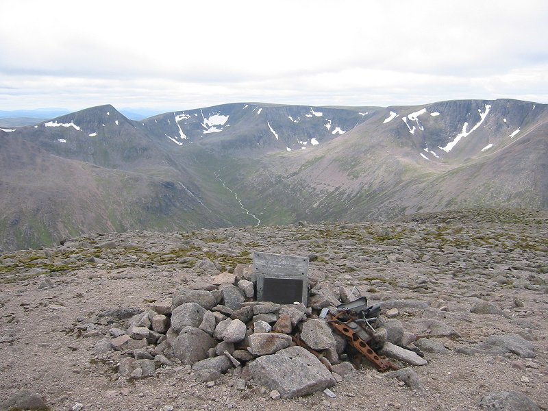
The area of the summit of Ben Macdui on a OS 1:50,000 Landranger map; click on the image for a larger version
3.1 Aircraft wreck sites
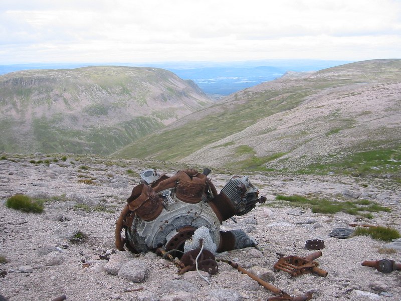
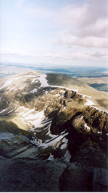
The upland areas of the UK have many sites where aircraft have crashed, and for one reason or another have not been completely cleared away (see my website pages about these sites here). Taken in total, these sites number in the hundreds. Some of the sites contain very large areas of wreckage that have lain at the site for over 60 years; but no OS map shows the location or extent of any of these sites. If a memorial has been constructed at the site of a crash, this is sometimes shown, such as the memorial a few hundred metres to the north-west of the summit of Ben Macdui (the second highest summit in the UK) to the Avro Anson that crashed near the summit in August 1942 (see an image of a section of the OS 1:50,000 Landranger map showing the summit area of Ben Macdui to the right; the memorial is marked by a small black empty circle and the world ‘Meml’). However, the wreckage of the aircraft itself (which can in some cases cover an area of several square kilometres) that is marked in some instances by these memorials is not shown on any OS map.
It is difficult to deduce what the rationale is behind this choice. The OS has clearly decided that a memorial (or a cairn) is a permanent ‘feature’ worth mapping but the wreckage itself which has been at the site longer than the memorial and in many cases covers a much larger area with individual pieces much larger than the memorial itself, is not worth mapping. The wreckage has become invisible on the map, but it’s still there nonetheless (see a photo of the Ben Macdui memorial here and a photo of a large piece of the Anson wreckage, about 100m away from the memorial here).
An argument can be made that these sites are essentially assorted debris from ephemeral human activities, on a par with industrial waste sites, and as such to portray their locations on a map would be needlessly pedantic and even petty. However, this argument could also apply to ruined farm buildings, ruined crofting houses and old unused fences and stone walls in the remote glens of Scotland, which are extensively mapped by the OS. Some similar features such as the sites of historical battles are also mapped by the OS, despite there being no physical remains of the battle at the site. The sites of sunken ships are also mapped by the UK Hydrographic Office (although there is a strong practical necessity for this, as potential hazards to shipping).

The River Garry in the area of Dalnacardoch on a OS 1:25,000 Explorer map; click on the image for a larger version
3.2 Controlled and modified rivers
Loch outlines changed by dams and hydroelectric schemes are shown on OS maps, but rivers affected by these same schemes are often not indicated accurately. One example of this is the River Garry in Perthshire which is displayed on the OS map running alongside the A9 road as a fairly large river (see an image of the section of the OS 1:25,000 Explorer map showing the River Garry in the Dalnacardoch area to the right); but this depiction of the river as wide (indicated by a ribbon of light blue enclosed by darker blue boundaries) is only true when water is released in a controlled fashion from the upstream hydroelectric scheme at times of high rainfall, snowmelt or to help with downstream salmon spawning (an artificial ‘freshet‘); at most times of the year this river is almost completely dry due to the diversion and abstraction of its waters, and in this temporal respect the OS maps do not show the river accurately. See a website with much information about the current state of the River Garry and photographs of the river here.
3.3 Semi-perennial snowpatches
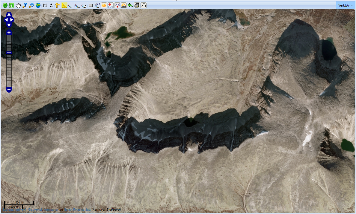
OS maps also do not show the location and extent of any semi-perennial snowpatches in the Scottish mountains (see my website pages about these features here). An argument can be made that these are only in existence as distinct features in the mountain landscape of Scotland for a few months each year, vary in extent from year to year and hence cannot be mapped usefully or accurately. However, snowpatches in Garbh Choire M�r, south of Braeriach in the Cairngorm mountains have only completely disappeared 5 times in recorded history (in 1933, 1959, 1996, 2003 and 2006), and then only for a few weeks each time before being replenished with new snow. The snowpatch in Garbh Choire M�r commonly referred to as the ‘Sphinx’ snowpatch after the climbing route and rock buttress above it, has been estimated to have been in continuous existence except for these 5 short periods of disappearance, totalling perhaps only 4 months in duration, since the ‘Little Ice Age‘ of the 16th to the 19th centuries. For most purposes then, some of these features are essentially ‘permanent’, certainly more permanent than some of the other features mapped in the upland areas of OS maps mentioned above.
What the OS maps do feature prominently however, are placenames, some of which refer to long-lasting snow, such as ‘Cuidhe Chr�m’ (meaning the crooked or bent wreath), which refers to a long-lasting snowpatch near the summit of Ben More near Crianlarich (on the OS 1:25,000 Explorer map of the area), and a location about 2km to the south-east of the summit of Lochnagar, although this area is not known for holding long-lasting snow and the placename appears to refer to a minor 1083m summit of Lochangar.
There is also ‘Coire an t-Sneachda‘ (meaning corrie of the snow) which is most widely known as referring to one of the corries in the northern corries of the Cairngorms, but there are also others, to the south-east of the summit of Beinn Bhrotain in the Cairngorms, to the south-east of the summit of Toll Creagach between Glen Affric and Glen Cannich, and to the north of the summit of Beinn Mhanach between Bridge of Orchy and Loch Lyon (spelt as ‘Coir an t-Sneachda’ on the OS 1:25,000 Explorer map of the area).
The placename ‘Leac an t-Sneachda’ (which appears to mean something like the flat stone/slab/hillside/slope of snow) also appears about 1.5km to the north of the summit of Aonach Mor (on the OS 1:25,000 Explorer map of the area). The ski slopes of the Nevis Range ski centre are located here and a long-lasting snowpatch in this corrie is known colloquially as the ‘snow goose‘ due to its remarkable similarity in appearance at certain points of the year (usually the early summer months around June) to the profile of a walking goose (a good photo showing an example of this can be seen here, and also another photo of the snowpatch can be seen here which shows the snowpatch with quite a different shape, but this time recognisably as that of a bird in flight). The restaurant located at the top of the Nevis Range gondola top station at an altitude of about 650m in this corrie is also called the Snowgoose restaurant.
What the OS don’t do is map the extent of the physical features which are referred to by these placenames; the existence of the placenames on the map just exposes the invisibility on the map of these features even more!
Some widely-used snowpatch placenames are not even displayed on OS maps. ‘Cuidhe Chr�m’ is also used locally in the area to refer to the long-lasting snowpatch at the head of Coire Cas above the Cairn Gorm ski centre but is not displayed on any OS map. The corrie immediately to the east of the summit of Ben Macdui is unlabelled on any OS map but is widely referred to as ‘the snowy corrie’. A large long-lasting snowpatch on Beinn a’ Bhuird in the Cairngorms is known locally as ‘the laird’s tablecloth’, but again this placename is not displayed on any OS map (it is instead labelled on the OS 1:25,000 Explorer map of the area as ‘Lar-choire Sneachdach’ and ‘Ear-choire Sneachdach’, meaning west corrie of the snow and east corrie of the snow, respectively). A snowpatch to the south of Brown Cow Hill in the eastern Cairngorms is known locally as ‘broon coo�s white calf’, but appears on no OS map, and neither does the ‘catskin’ snowpatch in Observatory Gully on the northern face of Ben Nevis and the Lady Alva’s web or veil snowpatch on the Ochil Hills just to the south of the summit of Ben Cleuch (although this snowpatch now appears only rarely, it did appear in the spring of 2010 and lasted until May; there is an article on the Caledonian Mercury website written by Dave Hewitt about this snowpatch and some of the others mentioned in this blog posting here).

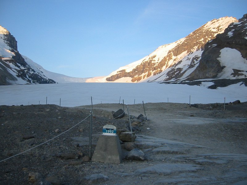
The Athabasca Glacier on a 1:50,000 recreational map of the area of the Columbia Icefield in the Canadian Rockies; click on the image for a larger version
It is instructive to see how similar features are mapped in other countries where they exist. Glaciers are mapped prominently in mountainous areas, with the extents and boundaries of the glaciers marked; this is despite the areal extent of many glaciers being anything but permanent from year to year. The Athabasca Glacier, part of the Columbia Icefield on the border between the province of British Columbia and Banff and Jasper National Parks in the province of Alberta in the Canadian Rockies has retreated significantly since exploration (by non-First Nations people) of the area began in the 19th century. A recreational map of the area of the tongue of the Athabasca Glacier (see an image of the section of this map showing the glacier to the right) shows graphically the different extents of the glacier since 1870. It should be stressed that this map is displaying boundaries which no longer exist in reality on the ground. However, on the ground there are marker signs at the foot of the glacier showing where the limits of the glacier used to be (see a photo of the tongue of the glacier and a sign which I took in June 2007 here).
This recreational map was created using topographical data from the Centre for Topographic Information, Natural Resources Canada, the Canadian National Mapping Agency.

The area of the summit of Storronden in Norway on a Statens Kartverk 1:50,000 topographic map; click on the image for a larger version
Smaller features than glaciers, which are more akin to the Scottish semi-perennial snowpatches, are also mapped in the maps of other countries beyond the UK. A good example of this are the Statens Kartverk (the Norwegian National Mapping Agency) 1:50,000 topographic maps of Norway which as well as displaying glaciers, show the locations and extents of smaller ice and snow features which could be described as ‘glaceriets’ or less permanent snowpatches. Storronden, a 2138m mountain in the Rondane National Park region of Norway that I climbed in August 2001, does not contain any glaciers on its eastern face or the Langbotn valley extending eastwards from the summit (see a picture I took in August 2001 from the summit looking down the eastern face here, and an aerial photograph of the mountain and the Langbotn valley here) but does contain many snowpatches, some of which are probably perennial (but perhaps are not composed of true ‘glacial’ ice). This is mapped as a blue area to the east of the summit of Storronden on the Statens Kartverk topographic maps (see a screenshot image of the online mapping of the area to the right; this image and the aerial photo above have been taken from norgeskart.no).
3.4 Harvey maps

The area of Coire an t-Sneachda in the northern corries of the Cairngorms on a Harvey 1:40,000 map; click on the image for a larger version
This inconsistent selectivity of features in the upland environment is not restricted in the UK to maps created by the Ordnance Survey; Harvey maps, although aimed primarily at people using the outdoors for recreation, such as hillwalkers and rock climbers, display choices that are just as selective and subjective as those of the Ordnance Survey. They show relatively small features such as individual large boulders in mountain areas (see an image of a section of the 1:40,000 Harvey map showing the Coire an t-Sneachda area of the northern corries of the Cairngorms to the right, showing a boulder a few metres across that is used by rockclimbers for bouldering, visible as a small black filled circle below the ‘t’ of the Coire an t-Sneachda placename), but do not give any indication of the locations and extent of aircraft wreckage or semi-perennial snowpatches.
4. The map is not the territory; beyond mapping
When (for example) planning a walking route in the mountains, or whilst actually in the process of navigating a way through a remote mountain environment, it is all to easy to visualise the unseen sections of the route in your head using the map and fall into the trap of assuming that this mental visualisation is an exact replica of reality. This can potentially lead to surprises and missed opportunities (or worse) when the reality conflicts with the visualisation.
‘The map is not the territory‘ is a phrase that is often used to describe this problem, and indeed neatly labels all the various issues of knowledge discordance detailed in this blog posting. This phrase was first used in print in a paper written by Alfred Korzybski in 1931. The phrase ‘ground truth‘ (often used in the context of military strategy and tactics) can refer to the same concept.
The idea behind ‘the map is not the territory’ can however be extended beyond the disciplines of cartography and geography to the limits of knowledge itself. Creative thinkers as diverse as the surrealist painter Ren� Magritte and the writers Laurence Sterne, Robert Pirsig and Neil Gaiman have explored this idea. The philosopher Alfred North Whitehead called it the ‘fallacy of misplaced correctness‘, which happens when an abstraction (a map being just one example) is mistaken for physical reality.
Borges, as well as his short story ‘On Exactitude in Science’, wrote a short story entitled ‘The Library of Babel‘ (originally published in 1941). In this story Borges imagines a library so vast and authoritative that it contains books with every single combination and permutation of characters; hence while the large majority of books in this practically and essentially (although perhaps not philosophically and mathematically) infinite library contain nonsense, there must be a subset of books within the library that collectively contain all possible knowledge.
Borges in some respects foresaw and envisaged the potential of the modern Internet and World Wide Web. The essential difference between Borges’ library and the Internet however, is that Borges’ library was rendered useless by the impossibility of indexing and hence finding anything useful in the library, whilst with the Internet there are search engines that attempt to carry out this herculean (or perhaps sisyphean?) task of indexing the entire Internet.
The attempt by search engines such as Google to index the entire Internet and websites such as Wikipedia to describe in detail all possible topics can be extrapolated to a fantastical level with the concept of an online digital library of all possible knowledge, indexed and accessible to all; however it is a trap that can be surprisingly easy to fall into to believe that this fantastic and improbable goal has somehow already been achieved by the enormous scale of the current Internet; just as the map is not the territory, Google is not the universe (or all knowledge).
Many sources of knowledge, information and data still lie beyond the grasp of Google. These include undigitised texts, images and objects (old-fashioned libraries of books and journals, archives and museums), and the ‘dark web‘ of databases that are not indexed by Google due to their being hidden behind security, authentication or payment barriers, not accessible by web-based communication protocols (e.g. Z39.50 databases) or not even physically connected to the Internet.
Indeed, the very terms ‘Internet’ and ‘World Wide Web’, whilst very often used interchangeably as synonyms, nevertheless are labels for different things; the World Wide Web (the specifications and protocols for which were developed by Tim Berners-Lee at CERN in 1990) is just the most visible subset of the much larger Internet (which was developed by DARPA in the 1960s). Much data, content and services which are part of the Internet are not part of the World Wide Web, e.g. emails, instant messaging, FTP servers, P2P file sharing and videoconferencing. Google does not index this.
However, this discrepancy between the map (the Internet) and the territory (all knowledge or information) is reducing as every day goes by. How close Borges’ fictional Library of Babel is approached by this seemingly inexorable process in the future is virtually impossible to predict.

mum
goodness ed that took some ploughing through
Bruce I. Kodish
Nice job, Eddie.
But you didn’t mention Josiah Royce in any of this, the one to whom Korzybski attributed the formulation of “self-reflexiveness” that he later elaborated upon.
It was likely a reading of Bertrand Russell’s discussion of the issue of self-reflexive mapping in the 1919 work Introduction to Mathematical Philosophy (http://bit.ly/zJvqwz) that led Korzybski to explore the notion further in Royce’s work.
Royce’s original discussion of the issue came in the Supplementary Essay in his The World and the Individual: The Gifford Lectures, First Series, here: http://bit.ly/xQOmLp
Bruce I. Kodish
See also Mark Monmonier’s How to Lie with Maps, Second Edition. http://amzn.to/ADp4Hh
Eddie
In The Power of Maps and Rethinking the Power of Maps, Denis Wood is highly critical of Monmonier’s How to Lie with Maps, although this doesn’t necessarily mean anything, as Wood is highly critical of just about anything to do with cartography and GIS.
Another book that I didn’t mention in this blog posting is Making Maps: A Visual Guide to Map Design for GIS by John Krygier and Denis wood, which is also worth looking at.
Eddie
There’s an article about the ‘dark web’ on the BBC news website here, focusing on its usage for illegal purposes:
http://www.bbc.co.uk/news/business-16801382
Eddie
Re. OS placenames referring to snow – ‘Mullach Coire a’Chuir’, a 639m summit near Lochgoilhead in Argyll, appears on OS mapping and is translated as ‘Summit of the Snow Hollow’ (pg. 83 Hostile Habitats, SMT 2006).
This summit has a steep north-eastern slope caused by a rock slope failure and this may hold snowpatches into the spring months.
Eddie
There is another ‘Coire an t-Sneachda’ on the Munro summit of Ben Lui, west of Crianlarich; this name only appears on OS 1:25,000 mapping and refers to the corrie directly south-east of the summit.
Eddie
This YouTube clip from the BBC comedy sketch show ‘Big Train’ shows nicely what happens when someone confuses the map for the territory:
http://www.youtube.com/watch?v=agFWob0E7ns
Eddie
The crash site of a RAF Airspeed Oxford, which crashed on Stob an t-Sluichd on the plateau of Beinn a’Bhuird in the Cairngorms in 1945 (see my web page about this site here), is not marked on any OS maps.
It is however marked on the 1:40,000 Harvey map of the area – see an image of this section of the map below:
It’s worth noting that, as in the case of the RAF Avro Anson crash site on Ben Macdui mentioned in this blog posting, the memorial is marked on the map but the wreckage itself is not. Unlike the OS map, the Harvey map does not have any symbol for the site, just the word ‘Memorial’ near the location.
Eddie
The feature named �Cuidhe Chr�m� to the east of the summit plateau of Lochnagar is “named after a snow field which lies late into the summer on the steep grassy face north of the 1083m top” (The Cairngorms, Adam Watson, SMT, 1992, pg. 212).
Eddie
Will Self on Jorge Luis Borges’ short story �On Exactitude in Science�:
http://www.guardian.co.uk/books/audio/2013/jan/04/will-self-jorge-luis-borges
Eddie
Other literary visionaries or pioneers who in some way predicted or foresaw the coming of an all-encompassing, accessible and authoritative universal library containing all human knowledge were:
Eddie
There have been many modern attempts to build this hypothetical ‘universal library’ (or perhaps Borges’ ‘Library of Babel’, or Wells’ ‘World Brain’). Wikipedia and Google Search have already been mentioned in this blog posting but there are other significant initiatives:
The list above is heavily weighted towards the United States and the English language, but other initiatives outside the US are:
Eddie
There are also many initiatives to create digital libraries of ‘geospatial’ content rather than ‘bibliographic’ content – this perhaps is the closest to Lewis Caroll’s ‘Perfect Map’ that modern technology can currently achieve – although with digital technology the 1:1 cartographic scale ratio becomes somewhat meaningless (indeed it could be argued that with augmented reality technology, the ratio is now weighted beyond simple 1:1 parity, and the model or representation of reality is actually more detailed than the real world, which is used as a ‘base’ layer in which additional contextual data is embedded):
Eddie
Another vision of the World Wide Web or Internet in literature, before these things existed, was Murray Leinster‘s short story ‘A Logic Named Joe‘, published in 1946.
Eddie
Some pictures of the River Garry can be seen here – these were taken in August 2014 in the vicinity of ‘intake 1′ at OS grid ref. NN 702 711 and show the effects of water abstraction of the river at that point:
Directly upstream of the intake
Directly downstream of the intake
The intake structure
Eddie
Re. OS placenames referring to snow – northwest of the summit of Carn Mairg, one of the Glen Lyon Munro summits, lies the river of Allt Coire Cruach Sneachda, flowing from the corrie of Coire Cruach Sneachda (roughly translated as ‘corrie of the snow stack’). The name of the corrie only appears on OS 1:25,000 mapping. This area does sometimes hold snow well into the summer months.
Eddie
A quote from the 2001 book “American Gods” by Neil Gaiman:
“One describes a tale best by telling the tale. You see? The way one describes a story, to oneself or to the world, is by telling the story. It is a balancing act and it is a dream. The more accurate the map, the more it resembles the territory. The most accurate map possible would be the territory, and thus would be perfectly accurate and perfectly useless. The tale is the map that is the territory. You must remember this.”
Eddie
Umberto Eco uses Borges’ short story as the inspiration for his own short story “On The Impossibility of Drawing A Map of The Empire On A Scale of 1 To 1″ in his 1994 book “How to Travel with a Salmon and Other Essays”.